HC Bolzano/Bozen Foxes
Rebrand Concept
Time for a change
As a player on this European professional ice hockey team during the 2015-16 Erste Bank Eishockey Liga season, I felt a new logo could help build and grow the Foxes brand in Bolzano/Bozen and its surrounding Italian countryside.

Why?
Lacking colour/stroke/design consistency, an update to their logo could provide many benefits to the franchise, especially new team merchandise for a fan-base craving the ability to display their unwavering support.
Concept logo
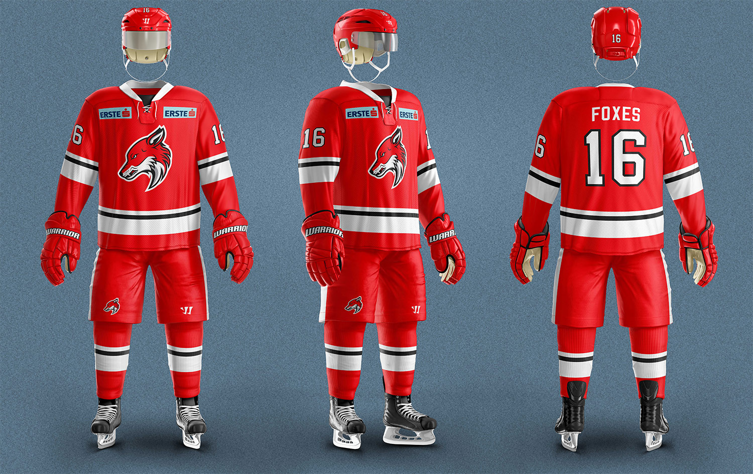
This fierce red fox is a drastic change from the team’s previous logo. Going for a much more modern feel, the fox presents an aggressive, yet composed, look.
The Details
Taking inspiration from HCB’s previous team colours, the contrast created by the refined red, white and black colour scheme is eye-catching and vibrant. The grey accent colour was not chosen at random either. Having just secured a new main sponsor at the time (Alperia - energy company), the grey in the foxes logo matches the grey of the new sponsor’s logo.
some more details
The FOXES wordmark completes the logo deck. The sharp corners of the custom font emulate the swift and cunning personality of this wild animal, and the two tone format resembles the fur of a true red fox. This wordmark is used in combination with the primary logo to produce the alternate logo.
How?
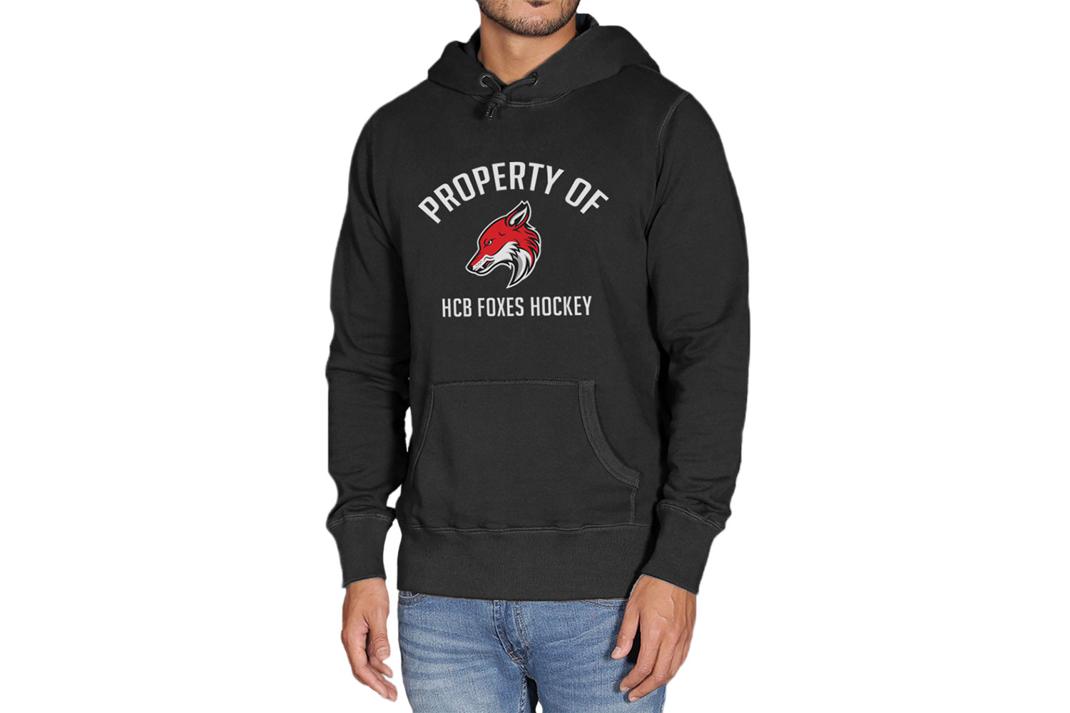
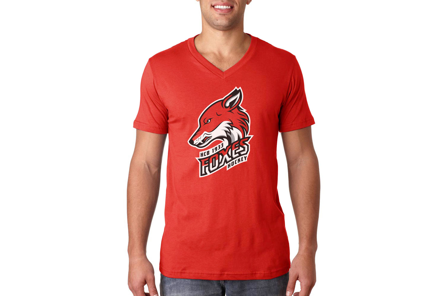
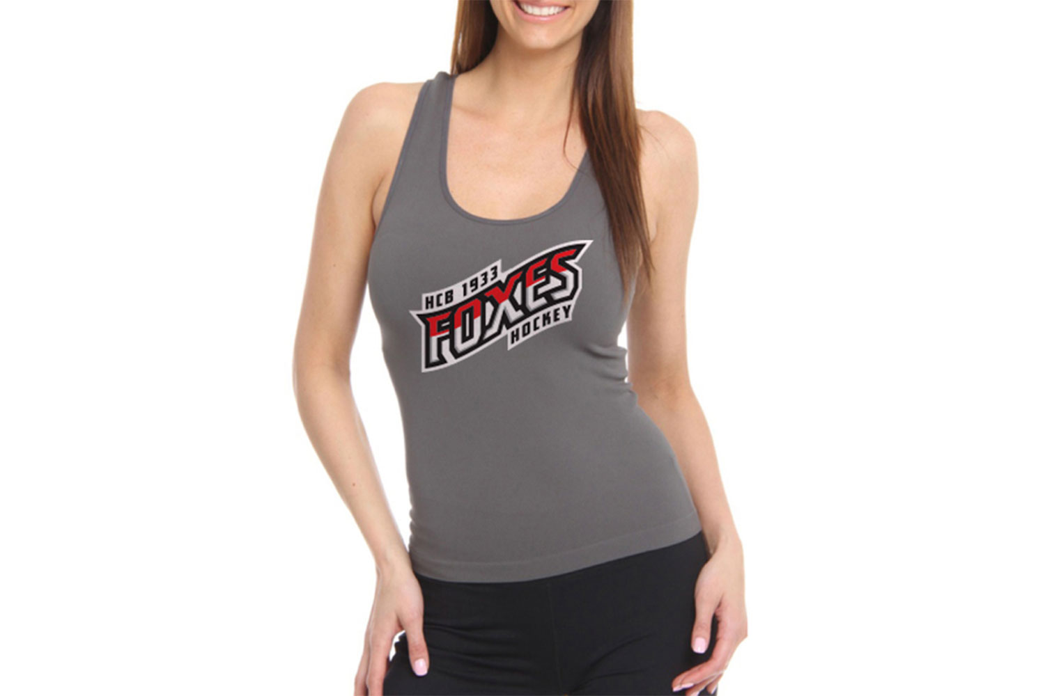
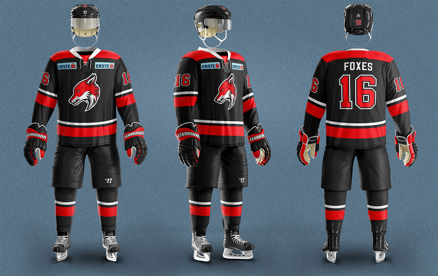
In order to get the attention of the organization, this had to be more than simply showing them the logo concept. It had to be a branding pitch to show the true value of what a new logo could do for them. This was achieved by creating mock ups for apparel, season tickets, advertising, equipment and jerseys. For the Foxes, this would be more than just a logo, in many ways it would be a leap forward for the franchise.


and there’s the pitch … strike!
On March 2nd, 2016, nearing the conclusion of that hockey season, I approached the team owner with this branding pitch. A high level of interest was shown by him and he was receptive to the possible benefits of a rebrand. Upon request, a file was sent to the owner containing the content above. The document was watermarked and stated that “these designs cannot be used, duplicated or manipulated without an agreed upon contract along with proper compensation”.
There was no further correspondence from the organization, and the Foxes unfortunately decided not to use the proposed Full Stride logo design.
Although, the team did end up rebranding themselves less than 80 days later and released new logos on May 19th, 2016.